The writer who didn’t write
It’s a little known fact that one of the most celebrated writers in the English language hardly ever wrote his own work. Instead, he composed his verses walking on a gravel path near his home, pounding out the meter to the timing of his footfalls. Once he had created a “draft,” he would dictate his composition to a family member or close friend.
That poet was William Wordsworth, widely celebrated for being one of the founders of English Romanticism, a movement that sought to democratize poetry by writing in “the real language of men,” not the affected language of the elites. While Wordsworth’s list of literary achievements is impressive, the contributions of his volunteer amanuenses—that is to say, secretaries or scribes—are no less so. However, one stands above the rest in the countless hours she dedicated to his work in the last decades of his life, forever shaping his legacy for generations of readers.
We named our writing studio in honor of this shadow scribbler. But before we delve into that story, let’s back up. How did we get here?
Finding our way
Chris founded Find A Way Media in 2016, which he named as a nod to a quote by Jim Rohn: “If you really want to do something, you'll find a way. If you don't, you'll find an excuse.” It was a challenge to himself to carve out a new career as a writer and build his business from scratch.
“If you really want to do something, you’ll find a way. If you don’t, you’ll find an excuse.”— Jim Rohn
That’s how I first met Chris—I was a newbie content marketer, working for one of his clients. I only spoke with him a handful of times, but I liked the articles he wrote, so I signed up for his newsletter and started reading his blog. When I went to grad school a year later, he fell off my radar.
But then, things changed. Instead of doing a Ph.D. like I’d planned, I found myself applying for jobs—and I remembered Find A Way Media. I reached out to Chris and, to make a long story short, I joined him first as a contractor, then as the business’ first full-time employee. (For the long story, you can check out this article I wrote: How I went from cat sitter to content strategist).
Soon after I came aboard, it became apparent that the name Find A Way Media no longer represented who we are as a brand. With a steady influx of business and an expanding team, we had, ahem, found a way to make it as a writing studio. Who are we now? And how do we want to communicate that to our clients and readers?
Visions and revisions
We spent a few months pondering these questions. While we had a sense of our mission and purpose—to bring clear, compelling writing and design to the verbose and cluttered world of B2B tech—we were missing a name and a story. We explored all kinds of possible directions; perhaps most memorably, Chris went down a research rabbit hole to learn all about the technical aspects of bookbinding. But nothing seemed quite right.
Then, while working on an article, I had a brainwave. I was writing about the struggles writers face that seem characteristic of our modern world—things like distraction and poor ergonomics—but actually are typical for writers throughout history. I used examples of famous authors: Victor Hugo had a procrastination problem, Herman Melville grappled with overzealous editors, and William Wordsworth found the physical act of writing so painful, he outsourced it to family and friends.
It was Wordsworth that sparked my imagination. While researching my article, I realized how much Wordsworth depended on the women in his life to transcribe not only his poems, but also his letters, essays, revisions, and explanatory notes. These women included his sister Dorothy, his wife Mary, and crucially, his dear friend Isabella Fenwick. It struck me that what these scribes did was an act of translation. They took Wordsworth's spoken word poetry and transmuted it into a format—text—that his audience could engage with.
There are striking parallels between what these women did for Wordsworth and what we do for brands: We take brands’ raw materials—their positioning, their wry, couldn’t-make-this-up-if-you-tried anecdotes, their intuitive understanding of their customers—and craft them into compelling written and visual stories. We act as their helpers and intermediaries, cultivating the seeds of their ideas into flourishing plants.
“There are striking parallels between what they did for Wordsworth and what we do for brands: We take brands’ raw materials—their positioning, their wry, couldn’t-make-this-up-if-you-tried anecdotes, their intuitive understanding of their customers—and craft them into compelling written and visual stories. We act as their helpers and intermediaries, cultivating the seeds of their ideas into flourishing plants. ”
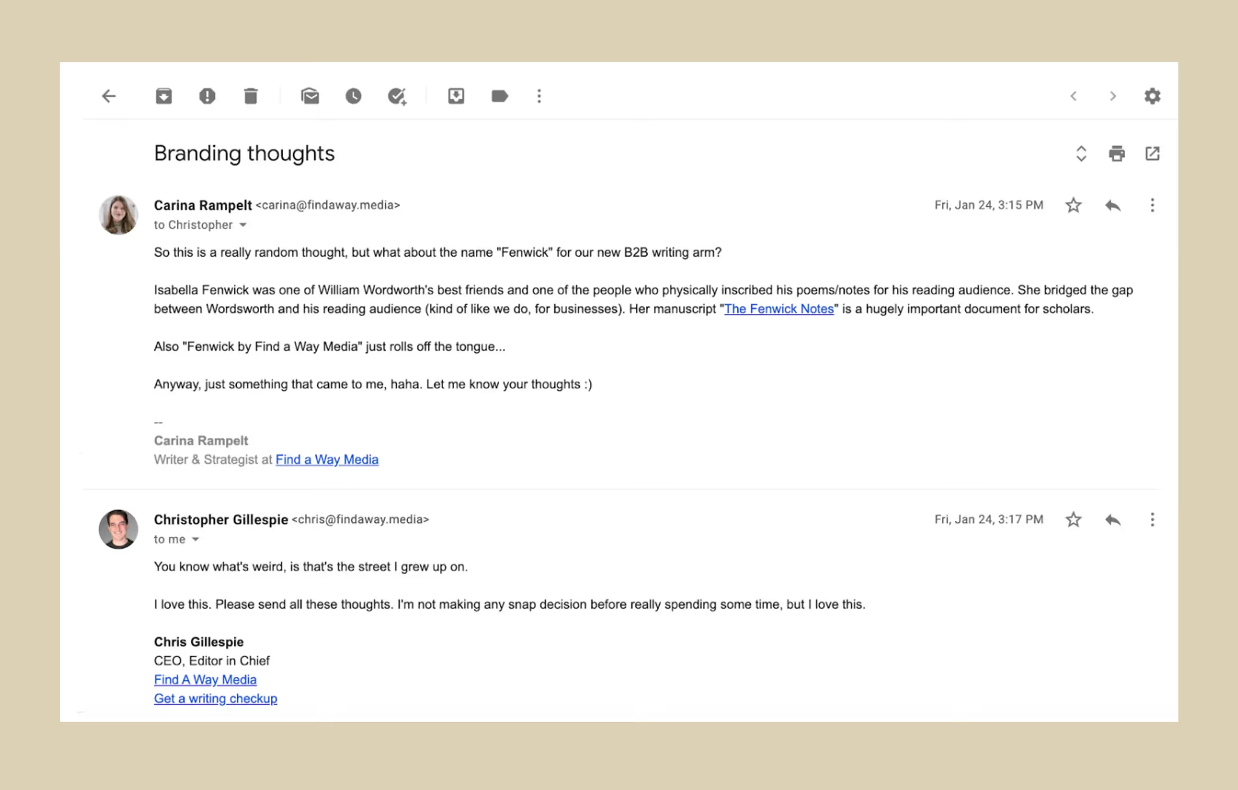
Excited, I proposed my idea to Chris: What if we called our studio ‘Fenwick,’ after Wordsworth’s friend and amanuensis Isabella Fenwick?
Who was Isabella Fenwick?
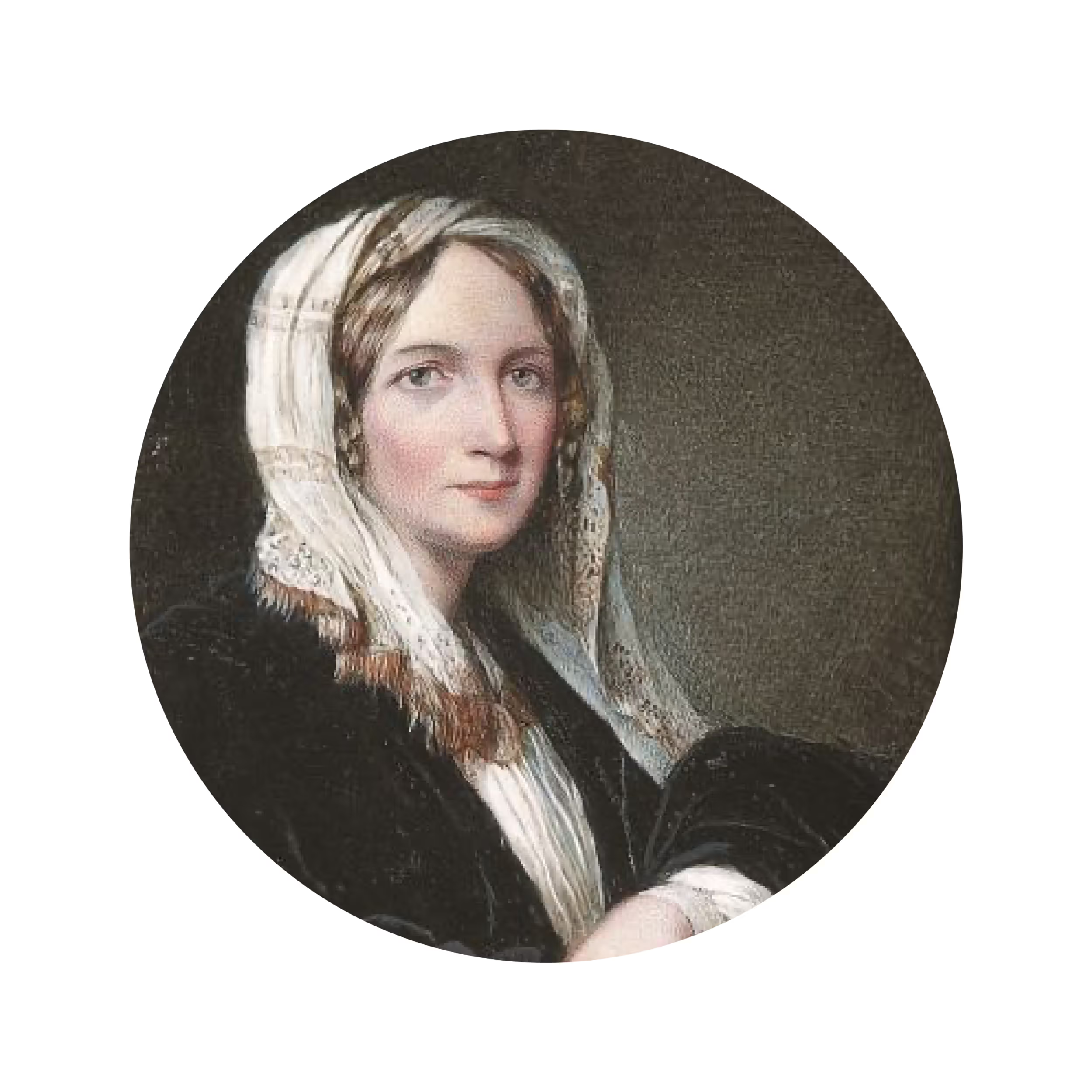
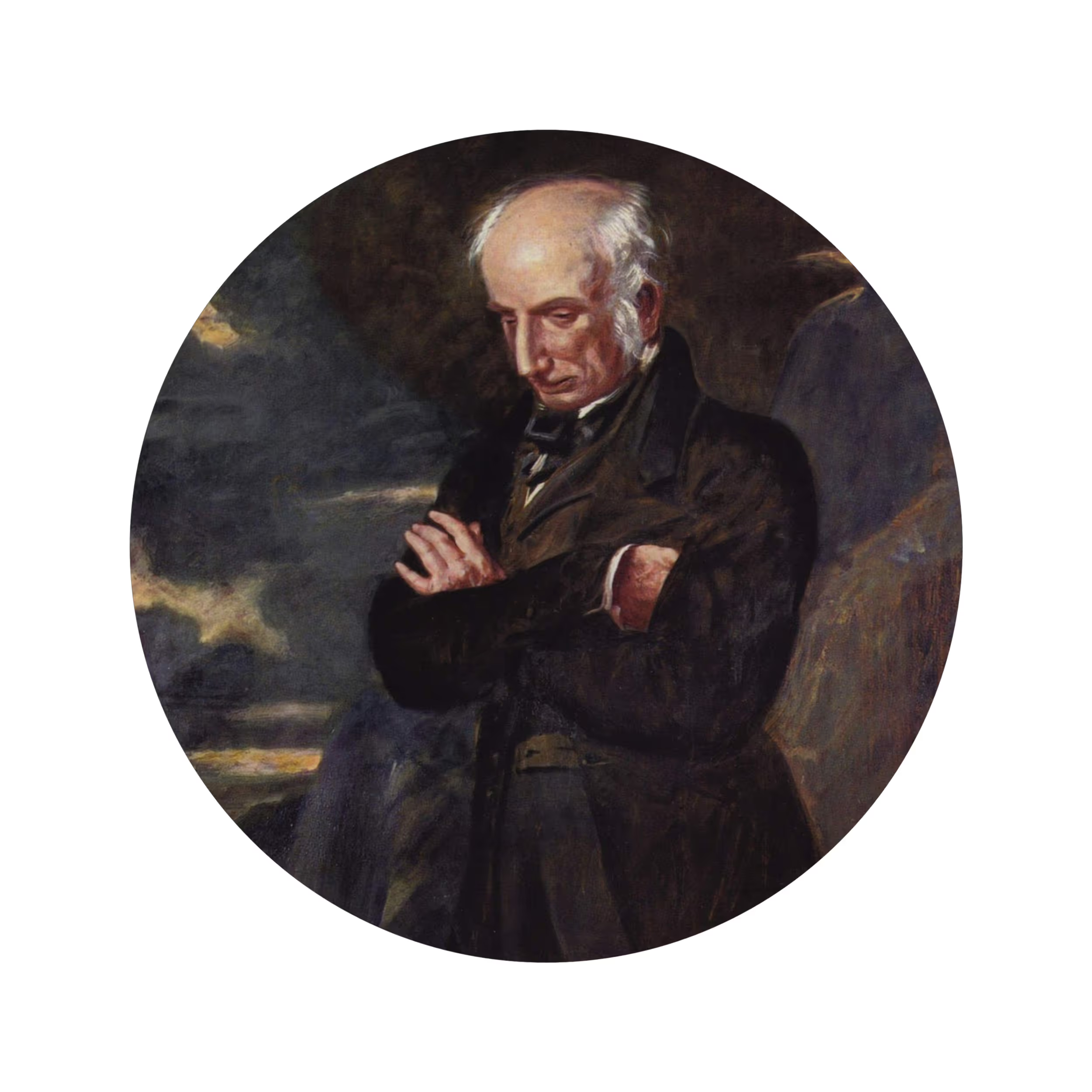
Isabella Fenwick met William Wordsdworth through her cousin, the dramatist Henry Taylor. The earliest record of their meeting is in June 1831, when she was in her late 40s and Wordsworth in his early 60s.
Soon after meeting, Fenwick and Wordsworth became inseparable. They were constantly in each other’s homes and Fenwick even accompanied the Wordsworths on family trips. Not only that, she was eagerly adopted as an honorary member of the family. In verse, Wordsworth referred to her as the “heart-affianced sister of our love.”
Her status as honorary sister placed her in a unique position. Like Wordsworth’s family members, she supported the poet by taking down his writing from speech. But she was also more assertive with him than the other members of the Wordsworth household. She pushed him to compile biographical notes describing the circumstances that gave rise to his various compositions—which he dictated to her over a six-month period—then hid the notes from him so he couldn’t make any more changes.
More than one hundred pages long, The Fenwick Notes give rare insight into William Wordsworth’s composition process and inspiration. Without Fenwick’s efforts, our understanding of this poet would be much less rich and nuanced.
Why Isabella Fenwick?
In Isabella Fenwick, we see values that we aspire to as a writing studio. Fenwick possessed a uniquely generous spirit. Unlike Wordsworth’s family members, she was an outsider. She had no innate investment in his work—rather, she was motivated by friendship and intellectual curiosity. As Sara Coleridge, a close friend, described her:
She is intellectual, but…never talks for effect, never keeps possession of the floor, as clever women are apt to do. She converses for interchange of thought and feeling, no matter how, so she gets at your mind, and lets you into hers. A more generous and tenderer heart I never knew.
While there are no doubt problematic conceptions of femininity at play (and I’ll get to those in a moment), this quote paints the image of someone who is intellectually curious, deeply empathetic, and filled with a reserve of quiet confidence—all qualities we seek to develop in the work we do. We don’t aspire to be the loudest voice in the room, we strive for writing excellence in order to lift up others’ stories.
“She converses for interchange of thought and feeling, no matter how, so she gets at your mind, and lets you into hers.”— Sara Coleridge
Our namesake also roots our brand in history. It was important for us to acknowledge that great writing and design don’t emerge in a vacuum but build on the work of the writers and artists that came before us. While we aim to be a distinctly modern voice, we look to history to inform our taste and shape our approach. If you look closely, the stylized ‘F’ of our new logo can be read as an ‘F’ and a ‘P’—harmonizing past and future into one character. The ‘F’ also marks continuity with our former brand name, Find A Way Media, giving a nod to our roots.

Finally, telling Isabella Fenwick’s story is integral to our mission. While Wordsworth’s family members are finally starting to gain the recognition they deserve—Lucy Newlyn’s recently published joint biography of Dorothy and William Wordsworth is a great example of this—Fenwick remains a footnote (sometimes literally) in history. When I began researching her, she didn’t even have a Wikipedia page. We changed that. We think it’s important to bring attention to a brilliant woman who influenced the work of the writers around her and, had she lived in another time, may well have been a prolific writer in her own right.
Is our fave problematic?
That’s not to say that christening our studio in honor of Isabella Fenwick is not without its complications, and I think it’s important to acknowledge these issues.
As I’ve already alluded to, Fenwick represents a problematic conception of femininity that was prominent in the Romantic and Victorian eras: the idea of the self-abnegating woman. By raising up a figure who quietly supported male literary greats and never took the spotlight herself, are we endorsing this outdated view?
I would argue it’s the opposite: We’re drawing attention to a female intellectual who never had the chance to occupy the literary spotlight because of the society in which she was raised. In eighteenth-century England, writing publicly while female—and especially selling the intimate productions of one’s mind—was regarded as no better than prostitution. That’s why so many books of this time period were published anonymously or simply, “By a Lady.” Even Dorothy Wordsworth, now regarded as a writer of equal status to her brother William, never published her own work in her lifetime—and wouldn’t have dreamt of doing so.
Still, Fenwick is a product of my own biases. When I did my master’s in English literature (1700-1830) at Oxford, the majority of writers I read were white and male. That’s why I’m so familiar with William Wordsworth and not, say, prominent 18th-century Black English writers like Phyllis Wheatley and Olaudah Equiano—literary greats who are just as worthy of academic study. By calling our studio Fenwick, am I perpetuating the narrowness of the canon I was taught?
I think it’s useful to invoke the term “problematic fave” here. Originating from the 2013 tumblr blog Your Fave is Problematic, the term refers to a popular or well-liked person, be they historical, fictional, or contemporary, who has said or done problematic things. According to Dictionary.com’s definition, a problematic fave “is one who’s said or done things that might be considered sexist, racist, or otherwise offensive to a group of individuals.” For instance, Shakespeare. Or Kylo Ren. Or Zooey Deschanel.
Importantly, as Dictionary.com notes, “naming someone a problematic fave is not a permanent condemnation; it’s a call to do better.” In this way, we recognize that Isabella Fenwick is an imperfect mascot. Still, we think her best qualities—her wit, generosity of spirit, and commitment to elevating others’ voices—embody the values we wish to emulate in our brand. As we follow in her footsteps, we also know we need to continue to do the work of anti-racism, anti-sexism, and inclusivity in our business.
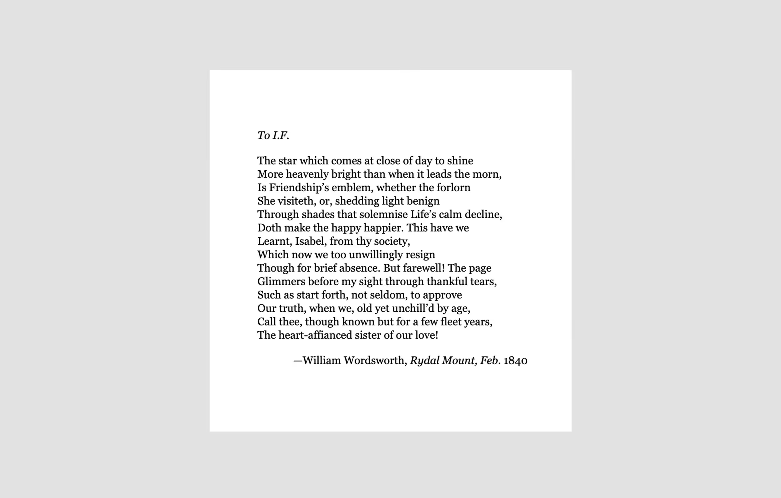
The star which comes at close of day to shine
Like Wordsworth, Isabella Fenwick is, paradoxically, a writer who did not write—she physically inscribed the works of others and impacted their thinking through her conversation, but did not leave behind works of her own.
Though she never had the chance to assume the mantle of authorship herself, she nonetheless left a deep impression on the work of the writers she worked alongside. Many of Wordsworth’s later works were inscribed by her own hand. The creative output of his last decades—as well as the plays of her cousin Henry Taylor—were no doubt informed by Fenwick’s observations and insight.
These men recognized her contributions and celebrated her privately. “There is a good deal of her mind in my writings. I wish there was more; and I wish that she had left her thoughts behind her in writings of her own,” wrote Taylor in his memoirs. In a poem dedicated to her, Wordsworth called her “the star which comes at close of day to shine,” telling her, “the page glimmers before my sight through thankful tears.” Though Fenwick’s day has now passed, we hope that by naming our studio after her we can elevate her star, so she glows in the light of her accomplishments once more.
