Ever received the following feedback on your work?
“I don’t like it.”
It resounds with an echoing finality. It is opaque. It is indifferent. It is an invisible target set by some pitiless authority. And why? Why won’t that person simply tell you what they want? Probably, they lack the language. Every discipline has its own proprietary phrases and habits, and design has an unusually precise and well-developed vernacular. This makes it tricky for those who aren’t fluent to provide useful feedback.
Which is why to designers, most feedback from marketers sounds like this:
“I don’t like it.”
But if you can learn to speak their language (it isn’t difficult), you can unlock true creative expression. Today, how to help your designer feel seen and achieve great things by selecting design-ier words. (Written by an admitted non-designer.)
You see graphics and colors. Designers see systems
Contrary to popular belief, designers don’t just add colors and resize logos. (Though yes, they can make that logo bigger. Even bigger? Okay.) They’re creating a visual system where everything feels concordant; where everything corresponds with everything else because when the angle on the font matches the angle on the icon, it creates pleasurable visual parallels.
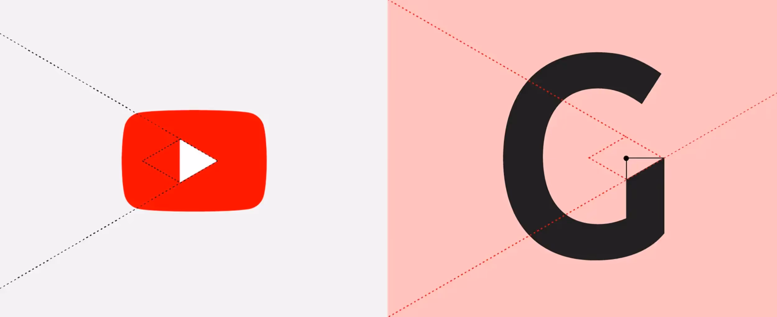
For example, an immense amount of thinking went into YouTube’s typeface, YouTube Sans, pictured below. Every angle is considered and it offers deep subliminal satisfaction.
Imagine this, with your graphical request. That’s what designers are trying to achieve. They’re trying to make the entire thing work as a system.
And thus, designers can’t “just change the font.” That whole design is an ecosystem. Everything’s placed just so. That font is in dialog with all the other fonts, the colors, the aesthetic, the mood, and the entire brand identity. Pull that font out and …
And if you know that, you’ll then also know:
1. You can rarely “swap out” one piece without damaging the system
We all know the feeling of being in a well-designed system. The Apple Store. A spa. McDonalds. These locations evoke a feeling because all the details are coherent. Pump in Nine Inch Nails and these spaces change considerably.
2. It’s helpful to communicate your needs in an ordered list
All designs have a visual hierarchy, which is roughly the order in which readers should interact with them. For example, a headline, a graphic, and a button. Which should readers view first? That’s actually up to you to decide. If you provide that list in the order things matter to you, it helps your designer understand your intent, and know where to place things.
For example, you might say: “Here’s what matters most, in this order:
- Headline
- Button
- Graphic (least important; sort of just ambient)”
Now they know what to make brightest, or put at top left. Organizing your own list is also a useful way to see for yourself that you’re asking for too many competing elements. Long lists create cluttered pages.
3. The earlier the input, the cheaper it is to incorporate
Changing ideas is cheap. If you say, “Let’s make this campaign lo-fi” while it’s still just an outline, easy. But if you wait until they’ve already produced it in a futuristic, 3D aesthetic? Now you’re talking about a total teardown.
4. Designers thrive on impressions, not advice
Just like with a car mechanic, don’t tell them what to change. Tell them about the “clonk-clonk-clonk.” They’ll know what to do. Don’t tell them, “Can we make this bluer?” Say, “This item feels buried to me.”
5. You are not your buyer
There’s a famous study where researchers sent 100 healthy patients to doctors and 15 percent were diagnosed with an ailment. They sent the remaining 85 to new doctors and again, 15 percent were diagnosed. Ad infinitum. People looking will always find something wrong. But is their input useful?
You are not your buyer. If you can’t separate your personal tastes from what is effective—from what your buyers actually like based on real tests—you may only be worsening the designs, as well as your relationship with your designer.
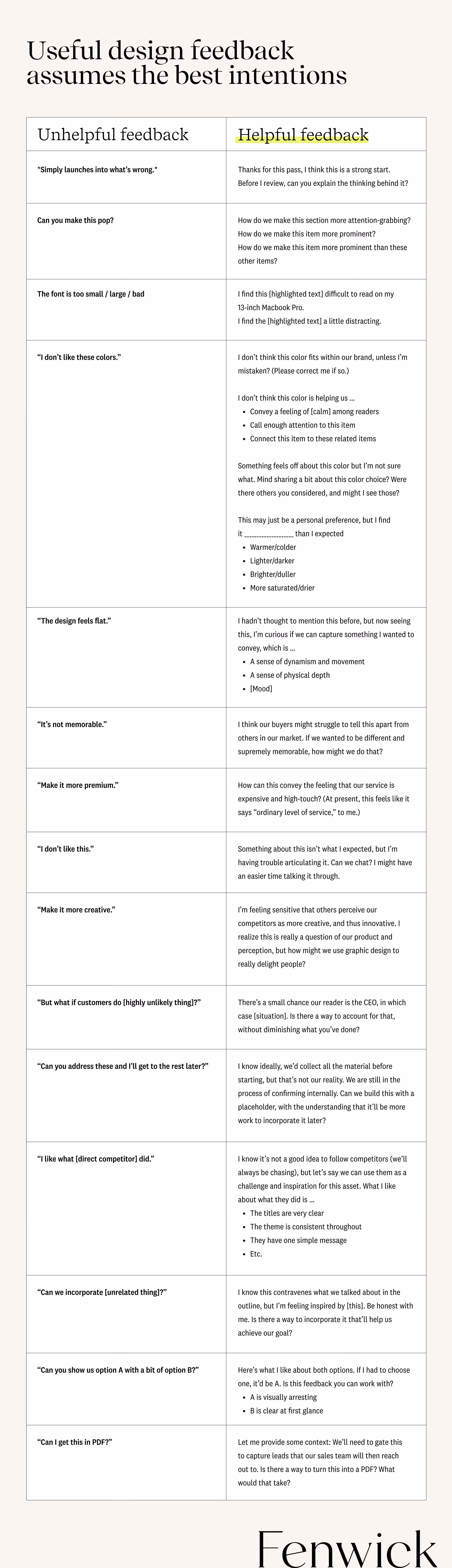
What helpful feedback sounds like—with phrases to borrow
That brings us to our table of useful phrases. Helpful design feedback is precise, assumes the best intentions, respects the designer’s sovereignty over the system, front-loads input into the earliest stage where ideas are most malleable, and offers impressions, not advice. And hey, it never hurts to start with a compliment.
In other words, helpful feedback sounds like this:
Speak the language, unlock creative expression
Ambiguous feedback shuts designers down. It’s the death of creativity. Rather than being entrusted to turn an idea into a visual or experience, those designers are shackled to prescriptions from folks like us who aren’t clear on what we need because we lack the language.
Whereas if you learn to speak design, you give your designer the freedom to create and have fun. And when they have fun, that’s when things pop.